
Correlation
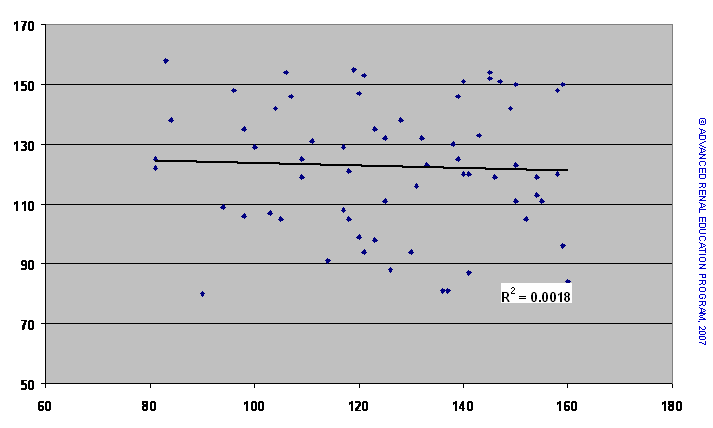
Are the values in one set of data related to those in another set? Do the values of one set move up or down as those of the other set rise? To answer this question we estimate the correlation between two data sets. The first step is to examine the data plotted on a scatter chart where each point represents one pair of data (X and Y value). Data that are not associated tend to form a random pattern, whereas those that are related will show a discernible pattern of association. The scatter plot below shows a completely random distribution of the points. We can reasonably state that the two data sets are not related.
The next scatter plot shows that as the values on the X-axis rise, so do most of those on the Y-axis. Most of the points fit quite close to an imaginary line drawn through the points, although a few deviate on either side. This chart indicates a close, positive correlation between the two data sets – the data move in the same direction. A negative correlation would be indicated where the points on the Y-axis decreased as those on the X-axis increased.
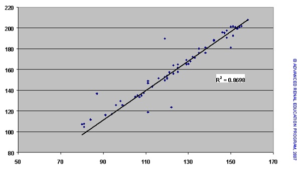
Statistics provides us with a means of measuring how close the correlation is between the data sets. This is termed the correlation coefficient and is usually represented by the symbol ρ or r. The possible values of r range between -1 and +1, and describe the magnitude and direction of the relationship: +1 indicates a very strong, positive correlation; -1 indicates a very strong negative (inverse) correlation; and zero indicates no correlation. The value of r when squared (r2 or R2) is known as the coefficient of determination. Again, the strength of association is indicated by the nearer the value approaches 1. The r2 value for the data in the first chart is low at 0.0018, whereas that for the data in the second chart is 0.87.
We cannot assume that there is a cause and effect relationship for these correlations. However, in those cases where we know that the value of X actually causes the response Y (for example, if Y were the response to the stimulus X), then we can further state that r2 represents that proportion of the response Y that is actually due to X. In the case for the right chart, 87% of the value of Y is actually due to X; that also means that 13% of the Y effect is due to a cause other than X, e.g., a random effect or an effect of a variable which is not measured.
References:
Dawson B, Trapp RG. Chapter 8. Research Questions About Relationships among Variables. In: Dawson B, Trapp RG, eds. Basic & Clinical Biostatistics. 4th ed. New York: McGraw-Hill; 2004.
Walters RW, Kier KL. Chapter 8. The Application of Statistical Analysis in the Biomedical Sciences. In: Kier KL, Malone PM, Stanovich JE, eds. Drug Information: A Guide for Pharmacists. 4th ed. New York: McGraw-Hill; 2012.
Godfrey K. Chapter 6. Testing for Relationships, Reporting Association and Correlation Analyses. In: Lang TA, Secic M, eds. How to Report Statistics in Medicine. 2nd ed. Philadelphia: American College of Physicians; 2006.
P/N 101851-01 Rev B 02/2021